When I first saw this type of photography at Rolex this year, I thought that this would be fairly easy to recreate. From just looking around at the horse park, I saw many objects, horse tack, architecture, and etc. that could be seen as a letter. Well I was very wrong!! Seeing the letters in ordinary objects is only have of the work. I soon found out after practicing at home that finding objects with a lot of contrast and color was the most difficult since I was making the letters b & w. Here are some examples (including failed attempts):
 |
| Letter F |
For the letter F picture, I did not like the contrast. The boards were too similar in color and did not make the F pop out as much as I would have liked.
 |
| Letter O |
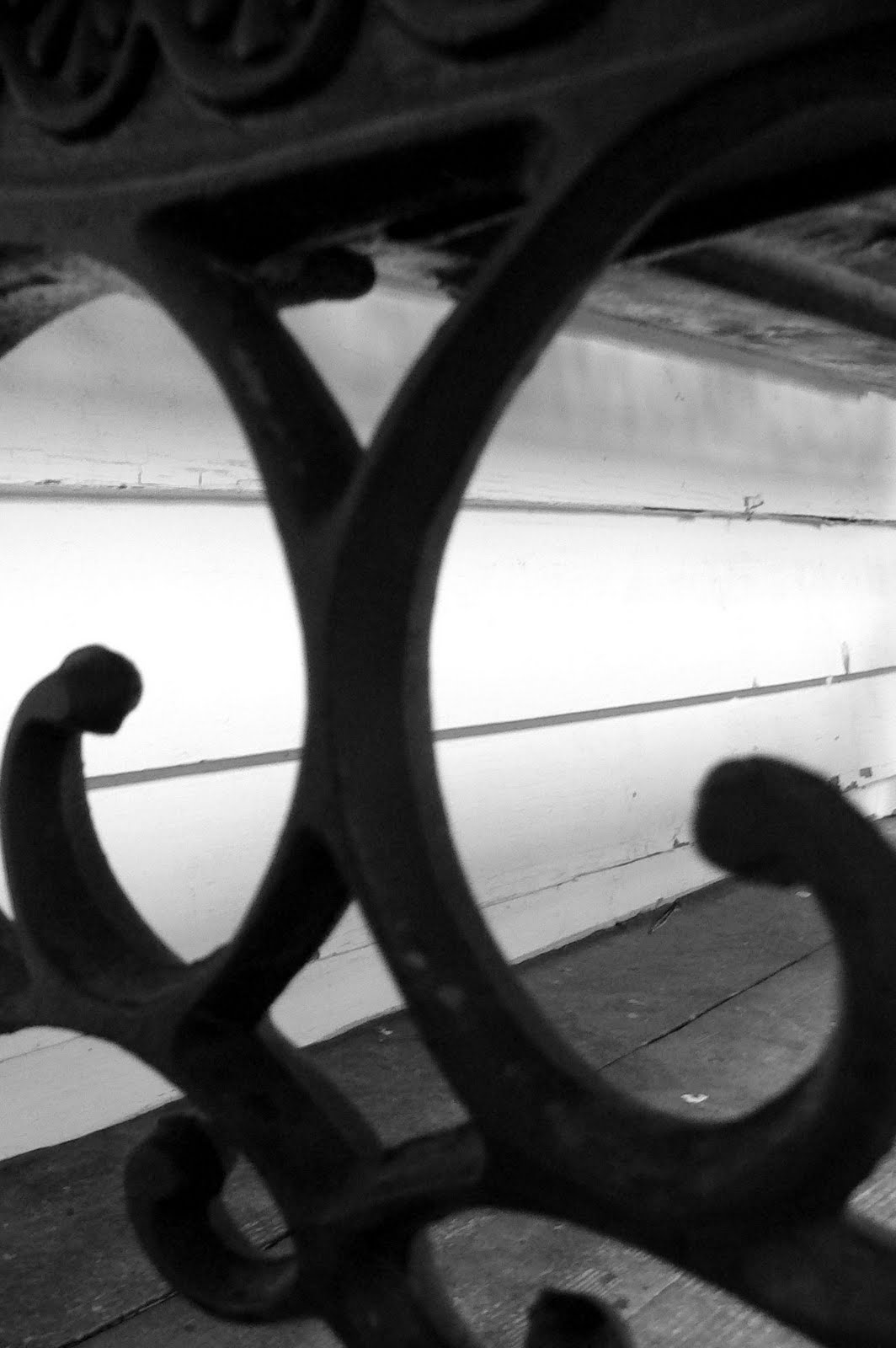
 |
| Letter X |
 |
| Letter O |
 |
| Letter D |
 |
| Letter E |
The letter E was more has more of an artistic look, but it is hard to read. I needed to play a little more with angles and move some of the flowers out of the way.
These are definitely not quite professional quality, but I took all the pictures on one day and at one place so I was very limited. I decided to create ALLEN and frame the pictures for my mom on mother's day. Below was the finished project for her present.
Although my attempts were not quite up to par, I would like to try again and focus more on contrast while incorporating equine objects. If you would like to purchase a frame of your own here are some websites I found:


No comments:
Post a Comment